


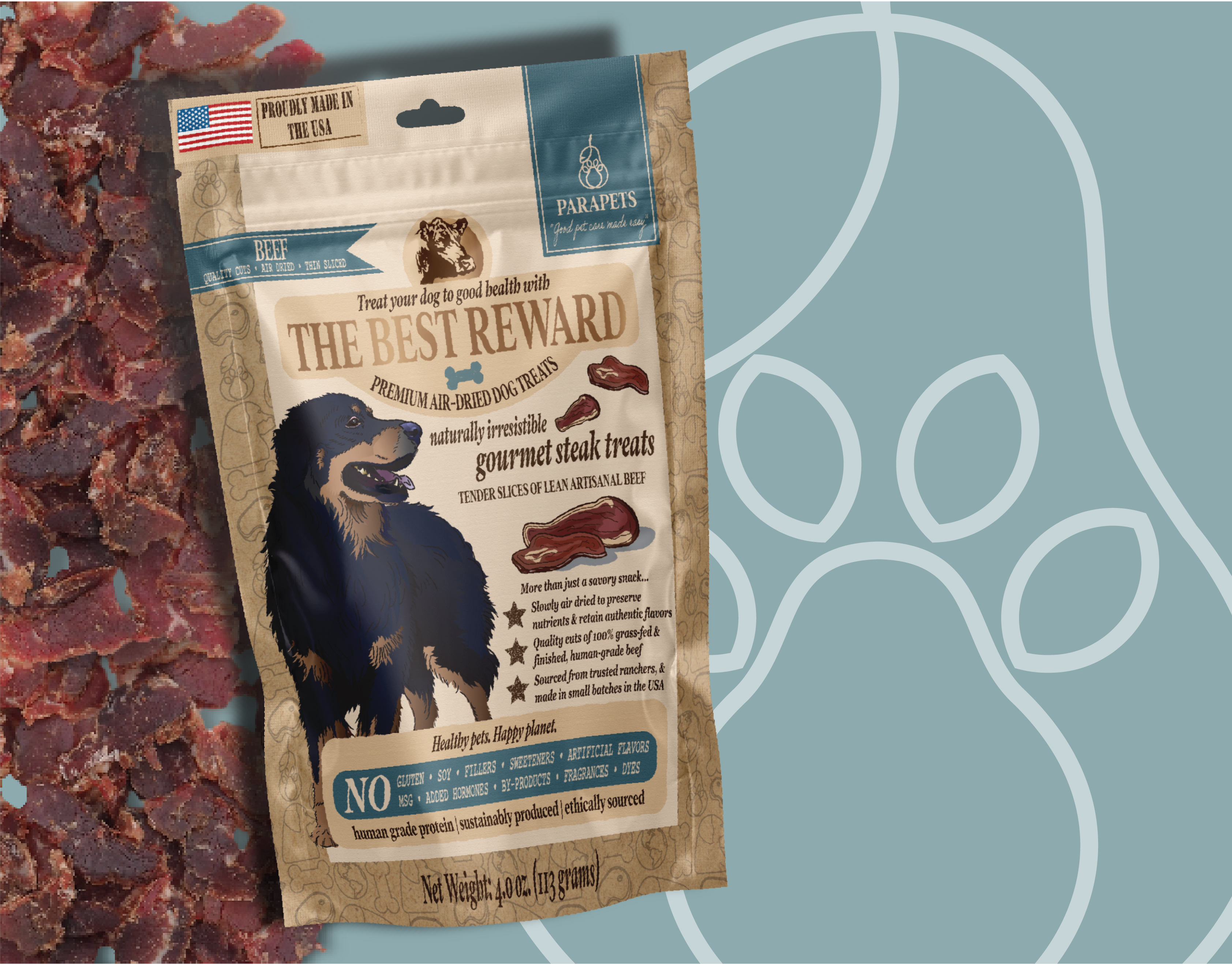
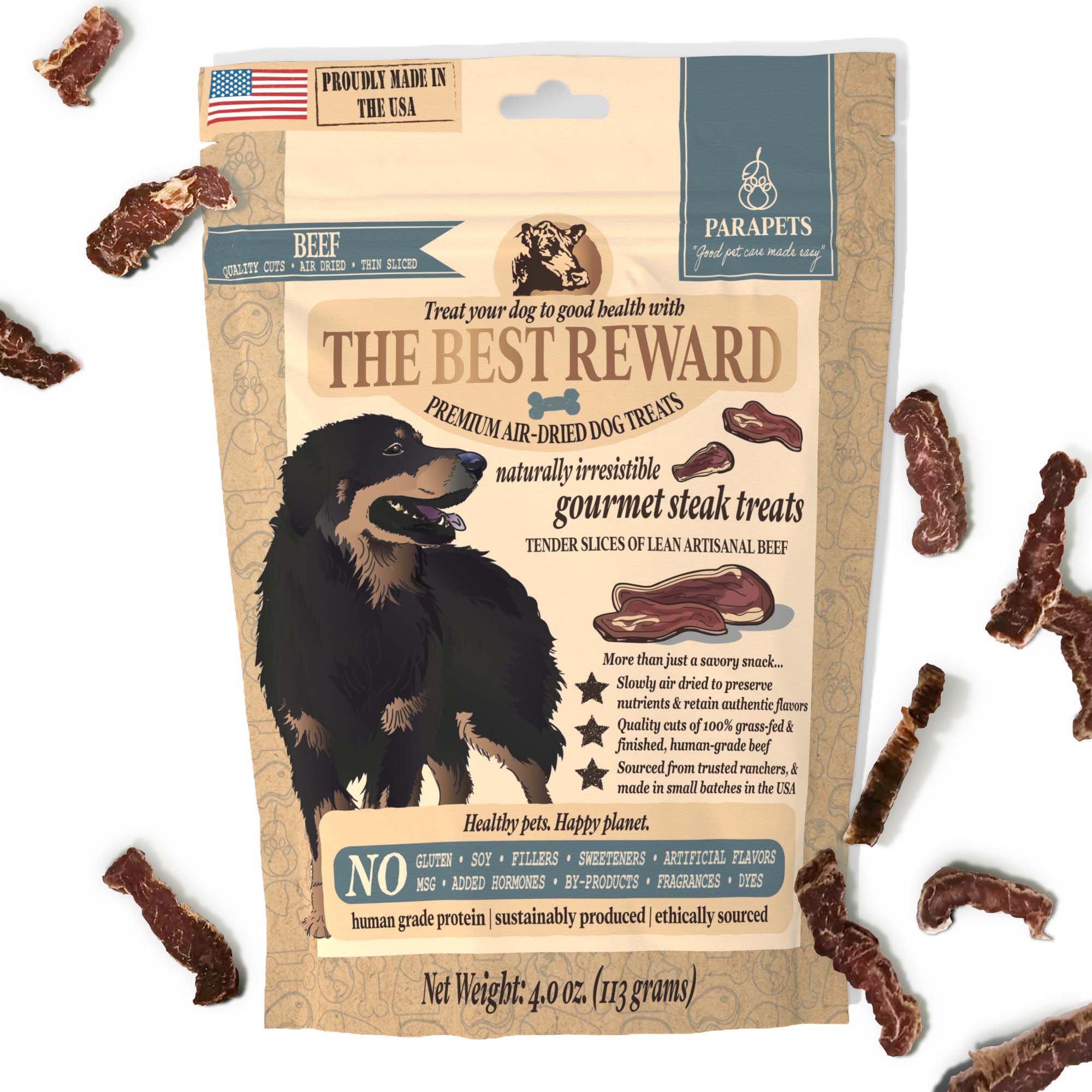
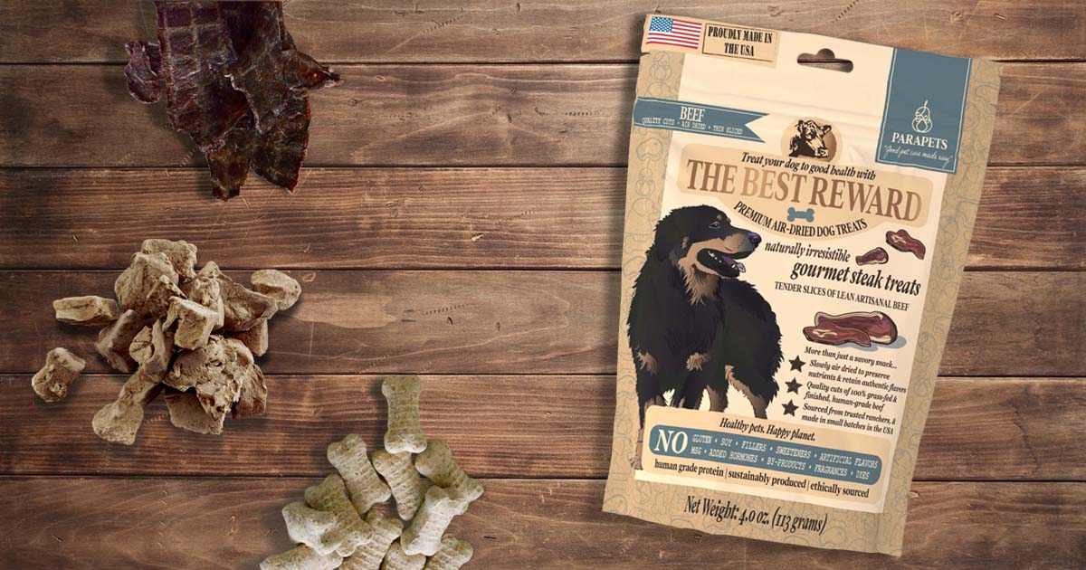
Final developed product + packaging.
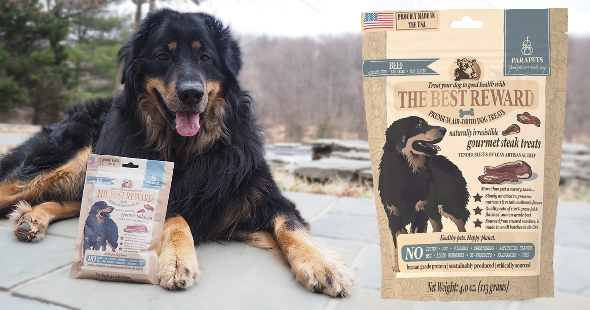
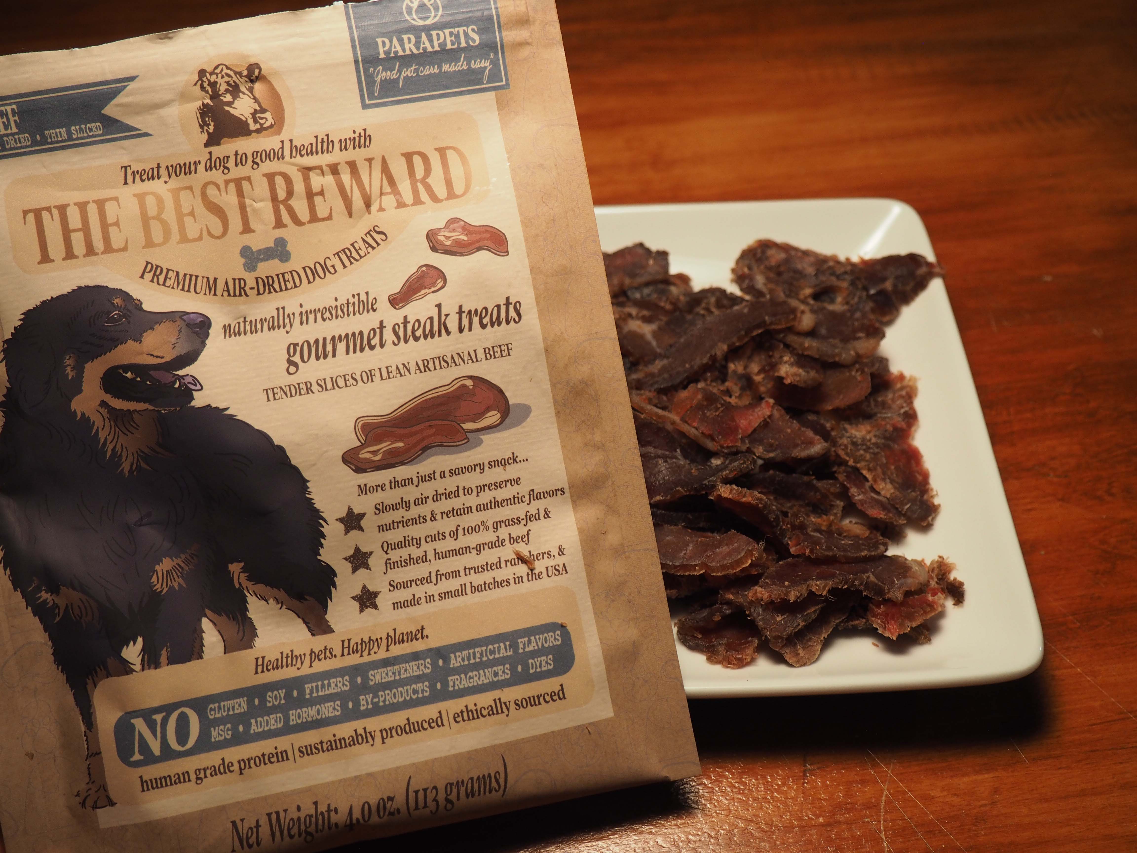
The founder's dog with the final product.


Context
Client
Parapets Co. was created to Make Good Pet Care Easy, offering mainstream-alternative products designed to be aesthetic, easy to use, and aligned with the biological needs of pets. I created the brand to support health-conscious pet owners with natural, commonsense pet care supplies. I served as my own designer and developer, creating all the branding collateral required for a product launch.
Objective
The primary objective was zero-to-launch development of a brand and pilot product.
Brief
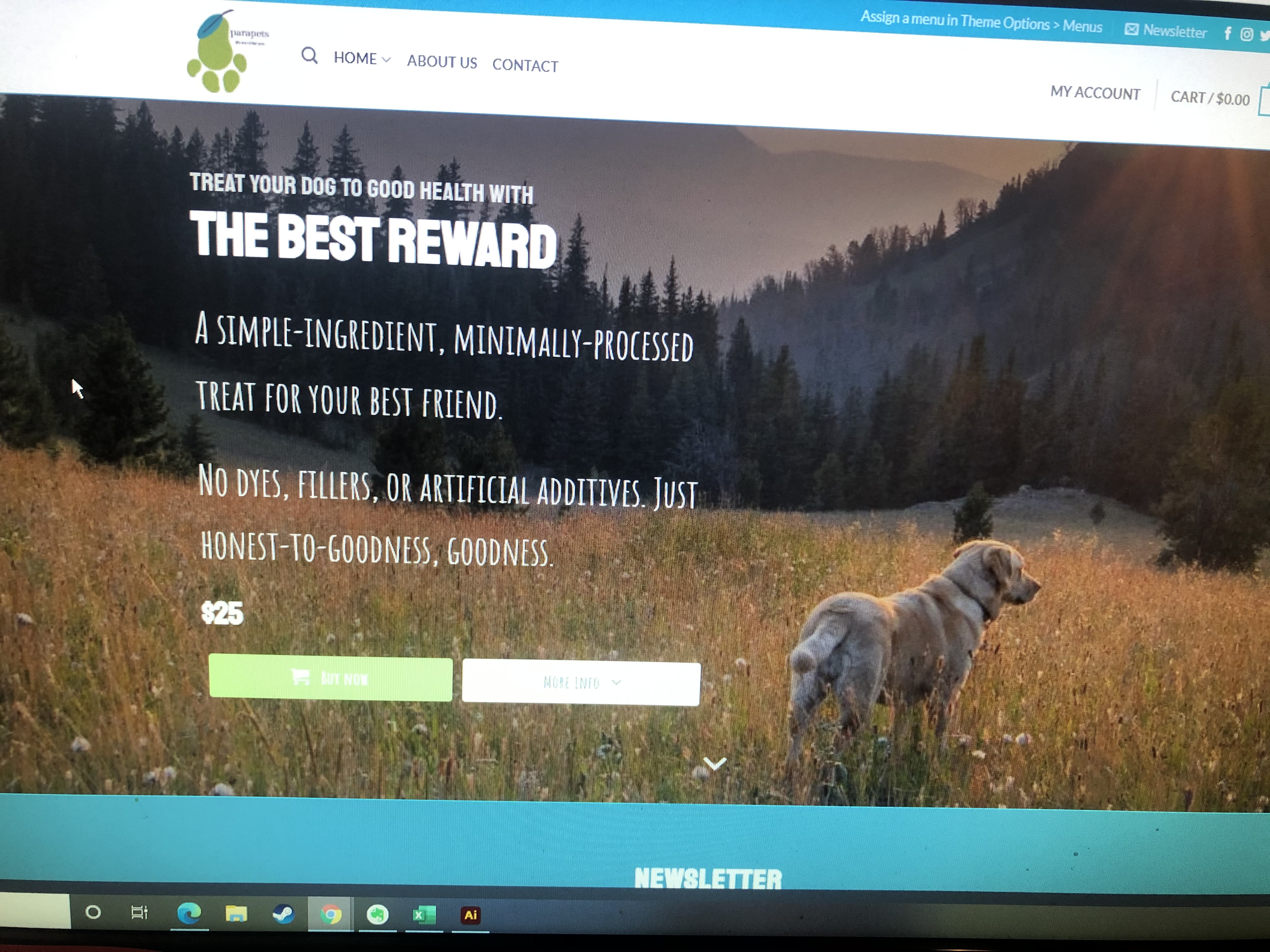
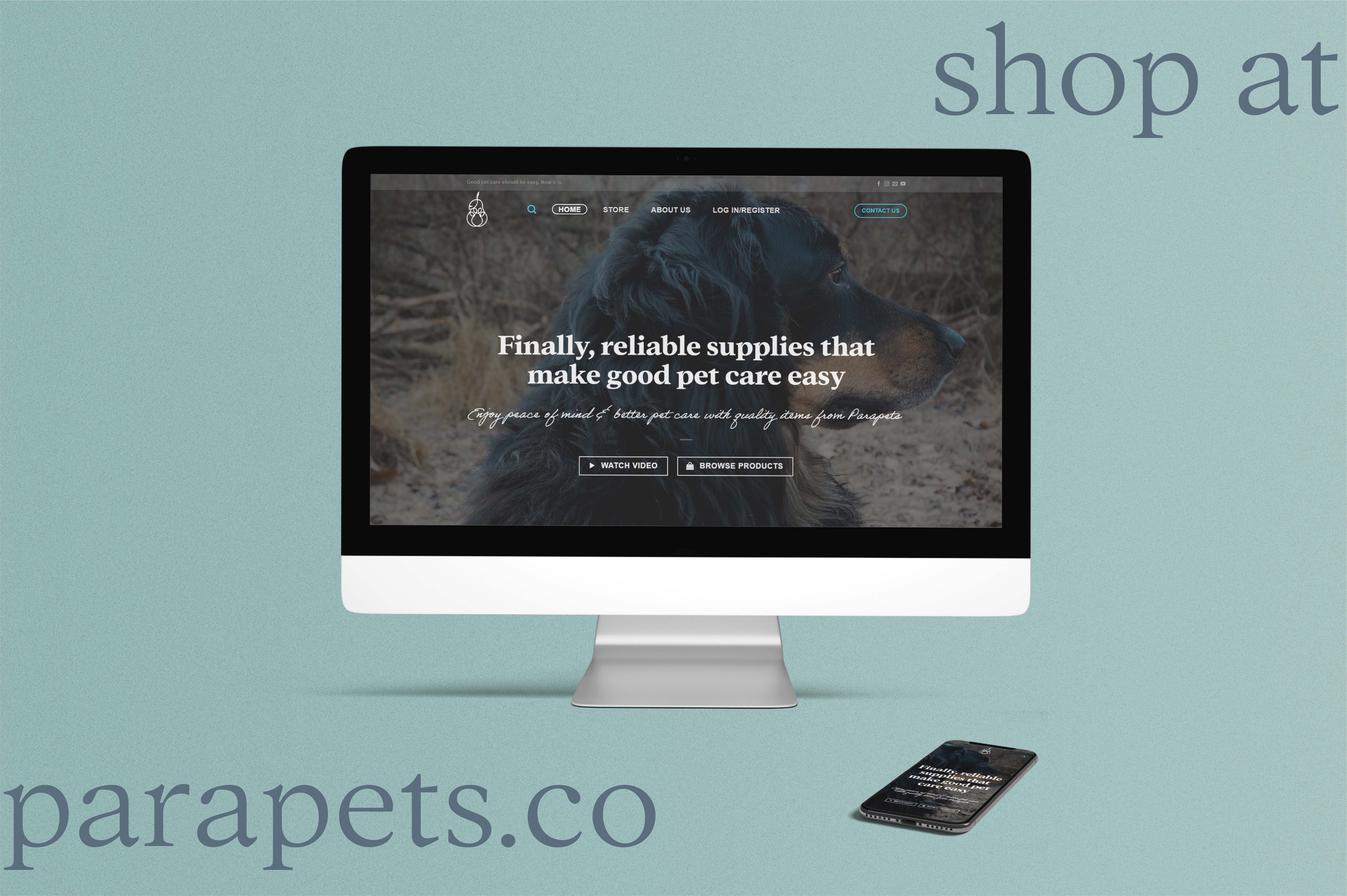
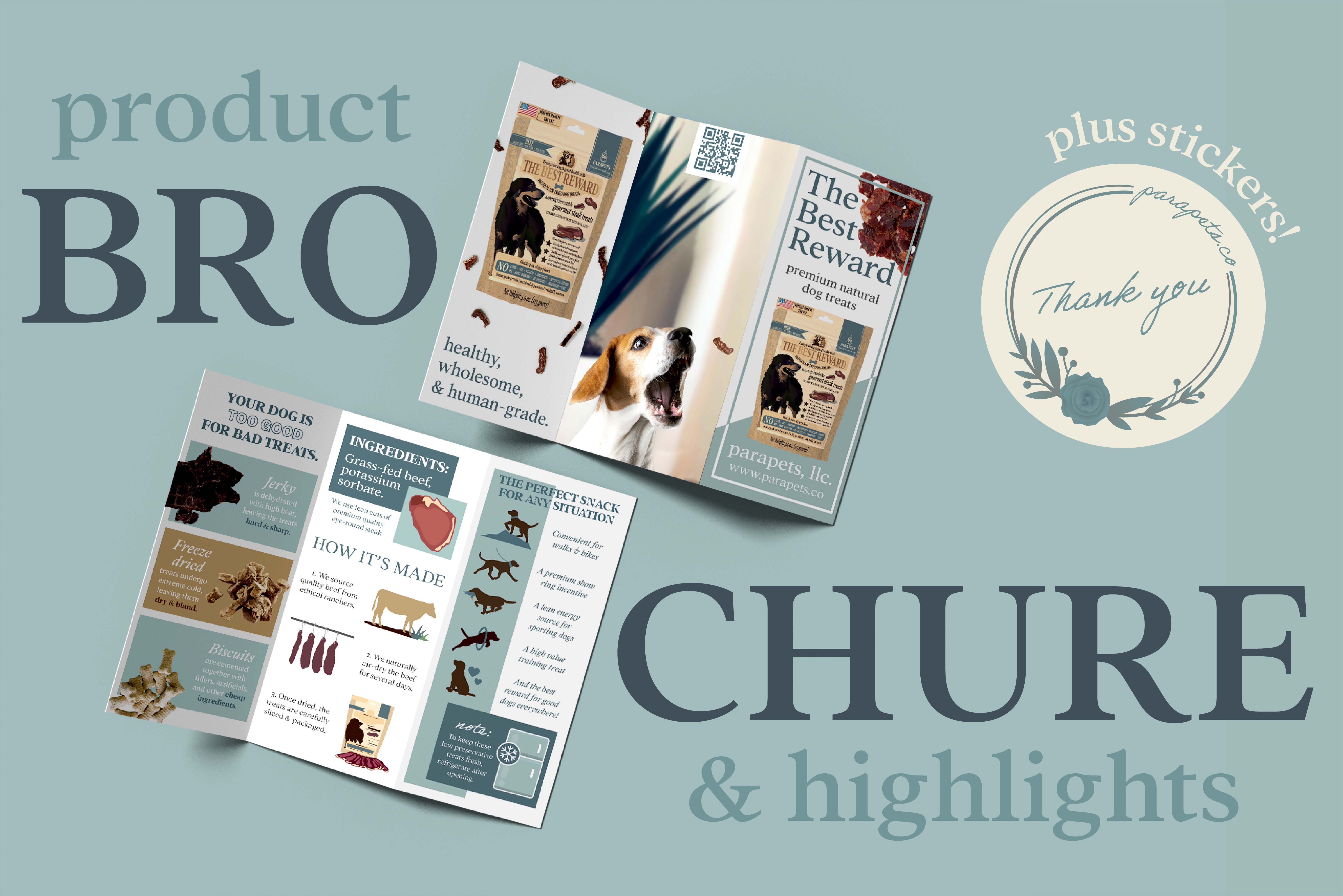
Deliverables included a cohesive brand identity, functioning e-commerce website, product R&D, sourcing, packaging design, and product photography, and promotional socials to launch and market a good reflective of the startup's countercultural philosophy and premium positioning.
I directed this process over the course of eight months, collaborating with pet nutritionists, contract manufacturers, and test-market consumers to bring the product from concept to launch.
Credits
I independently produced this project.
Foundation
Methodology
- Market analysis
- Anecdotal interviews
- Professional consults
SUMMARY
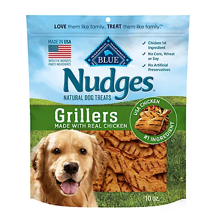
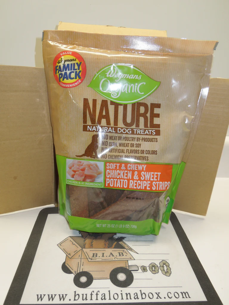
Competitive analysis revealed a market gap for soft, sizeable, minimally-processed dog treats. I explored parallel industries for product derivitives and botique CPG branding trends for natural wellness categories, noting the aesthetic and messaging patterns that resonated with health-conscious consumers. These insights informed a visual direction and brand voice designed to clearly differentiate Parapets Co from conventional brands that lacked niche alignment.

INSIGHTS
Competitive analysis revealed a market gap for soft, sizeable, minimally-processed dog treats. I explored parallel industries for product derivitives and botique CPG branding trends for natural wellness categories, noting the aesthetic and messaging patterns that resonated with health-conscious consumers. These insights informed a visual direction and brand voice designed to clearly differentiate Parapets Co from conventional brands that lacked niche alignment.
Design
Visual strategy
I focused on natural, earthy color schemes and textures paired with a hand-crafted aesthetic to reinforce the brand’s positioning and message. The visuals had to harmoniously meld the concept of clean, modern convenience with calls to the natural animal world. Font selection and cool color tones sought to reinforce the brand's calm, guiding authority.
Process
Iterations
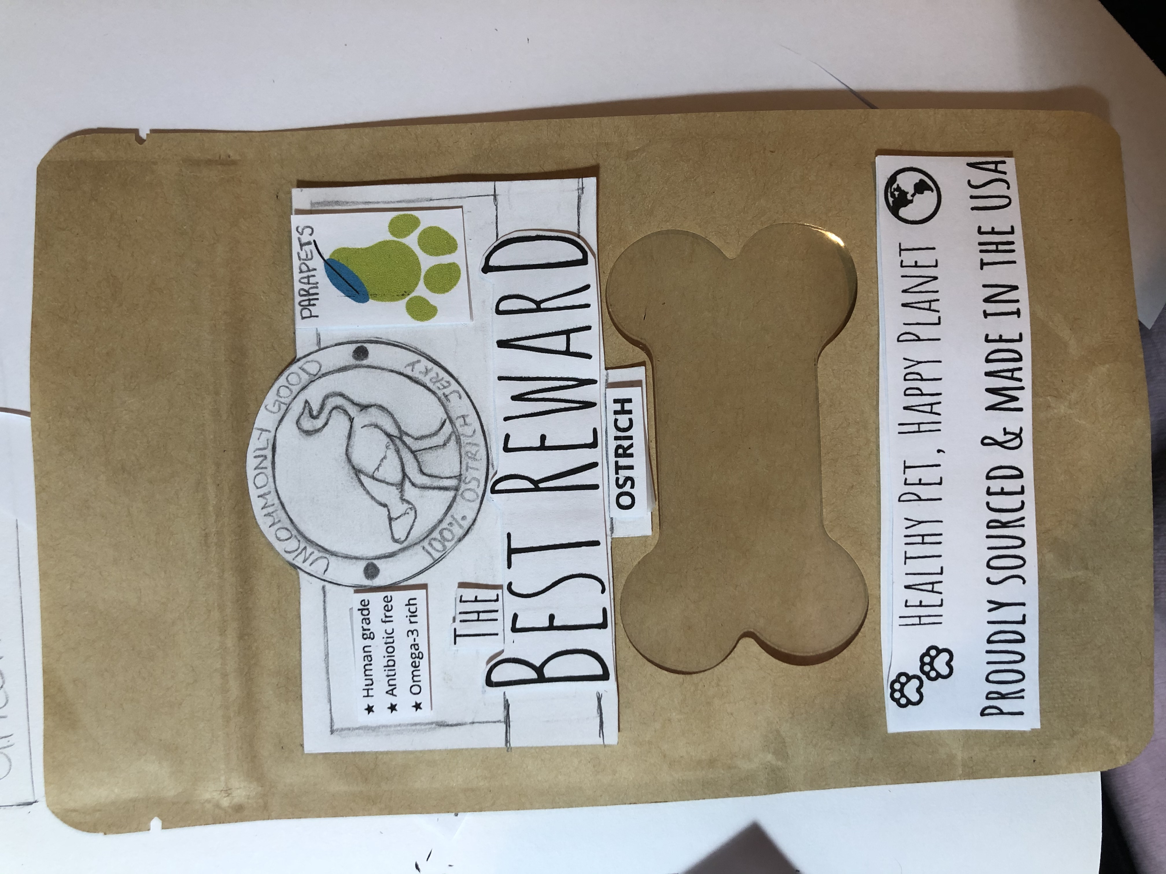
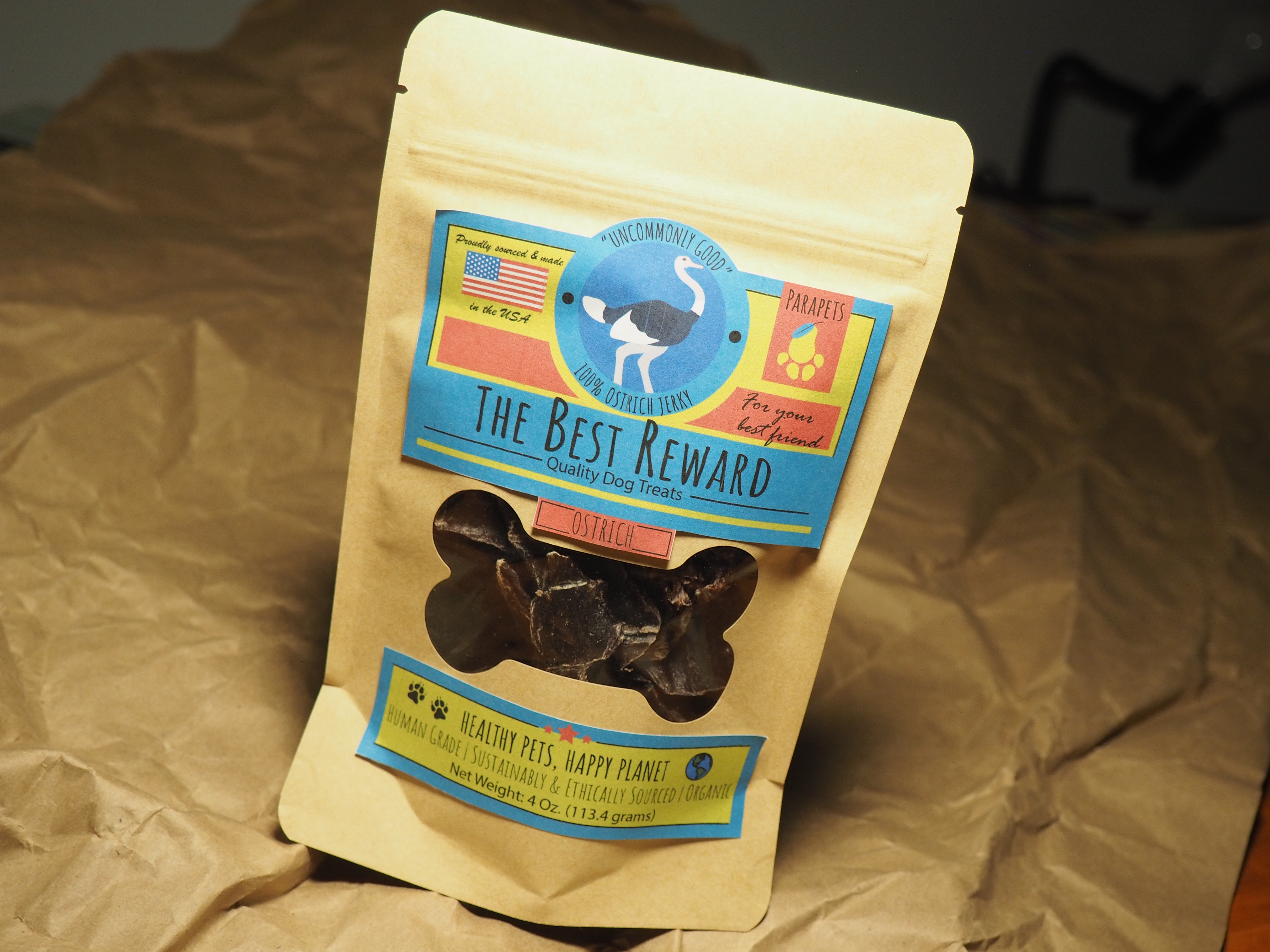
Intial branding was established. Oiginal product vision for an ostrich-based product to cater to allergen-sensitive pets.
Insights
- Cost inefficient
- Reliable sourcing
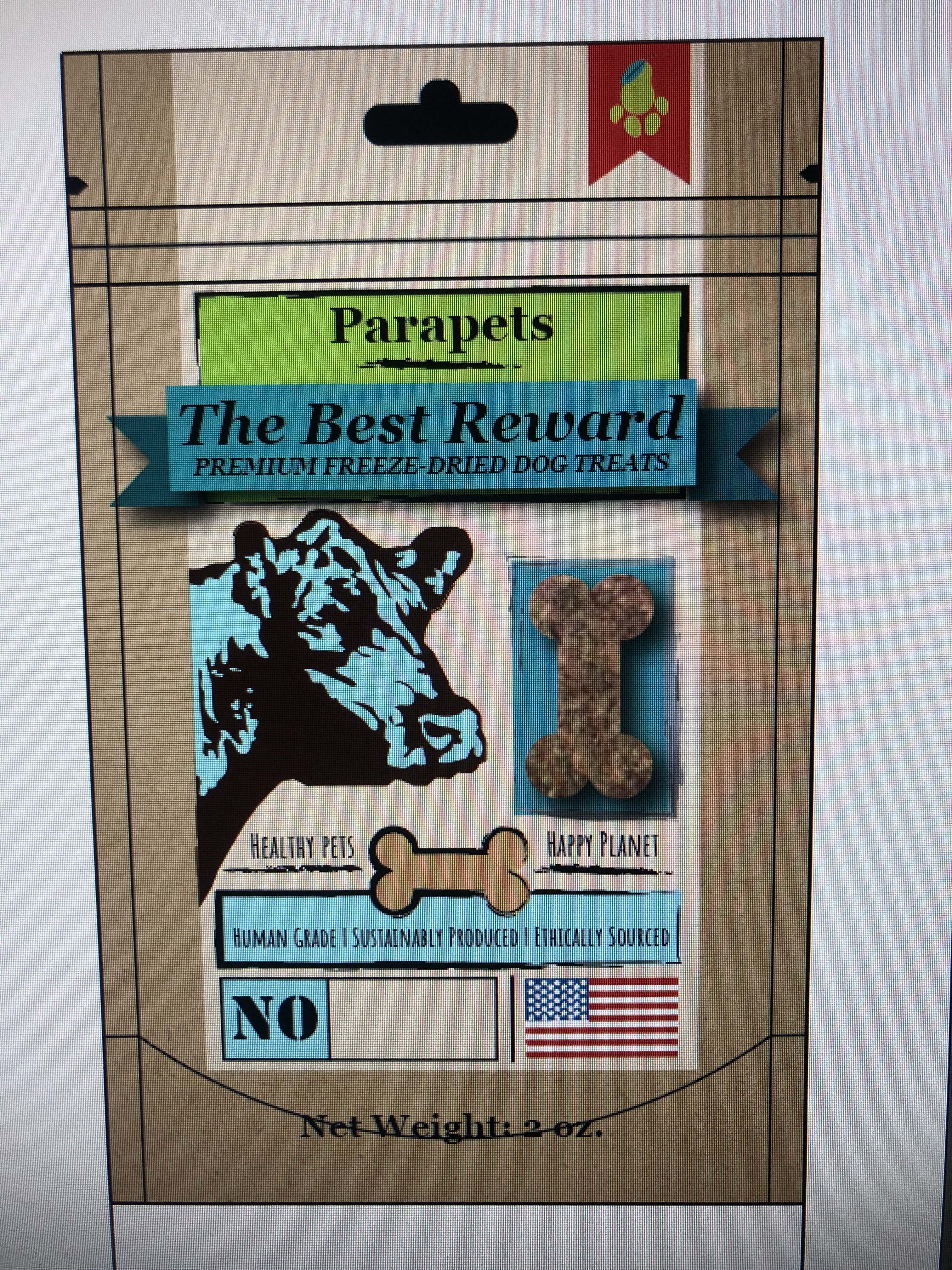
This version pivoted to a beef-based product. Dehydrated and freeze-dried options were explored.
Insights
- Dehydrated treats were sharp and rigid
- Freeze dried treats were chalky and bland
- Design needed enhancement
- Logo was symmetrically imbalanced
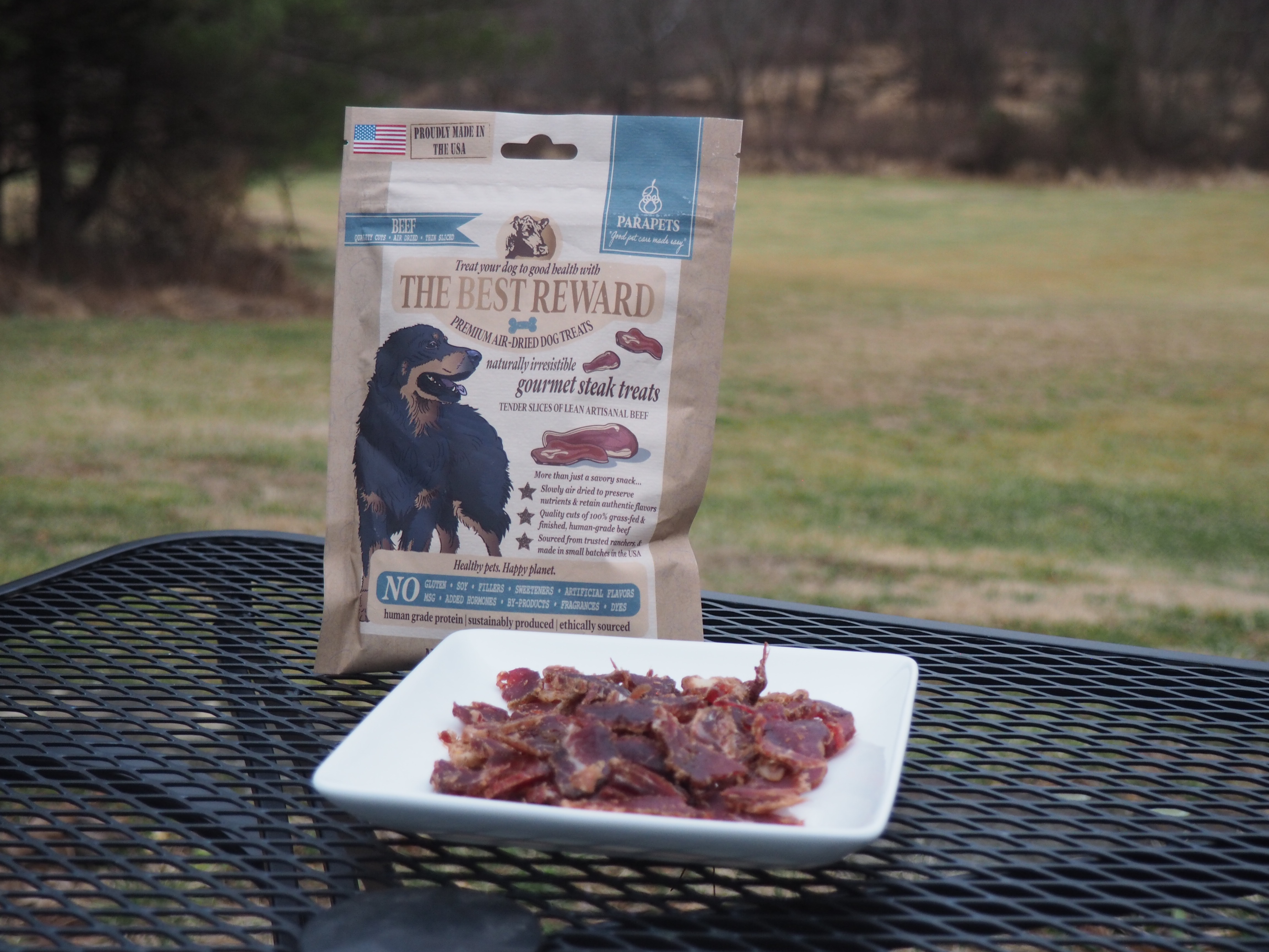
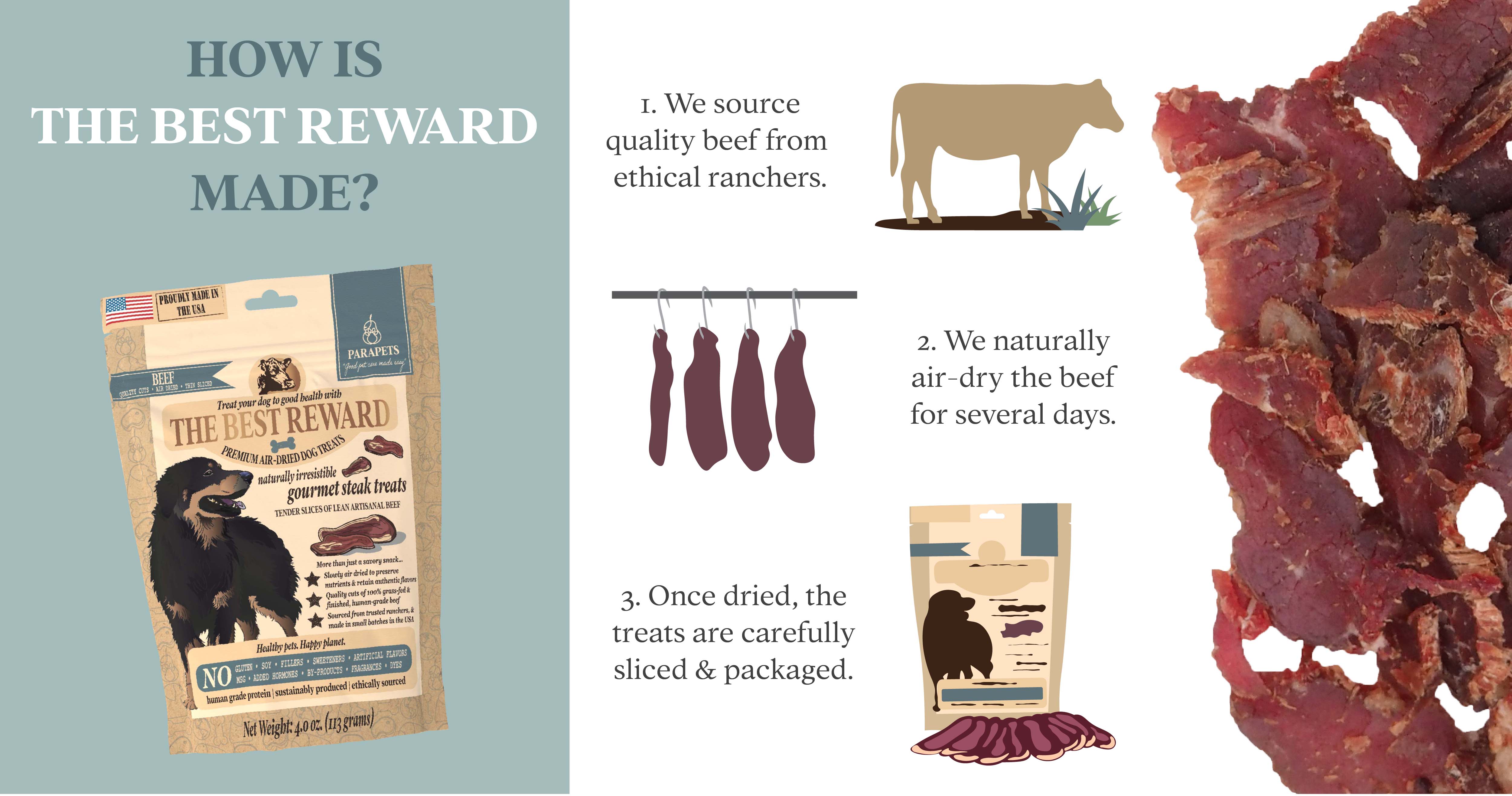
The final version of the product saw the selection of a unique air-dried beef biltong product.
Insights
- Premium but market-tolerated price point
- Unique among competition
- Package design evolved
- Logo refreshed and balanced
Assets


Reflection
Challenges
Serving as both client and designer presented a unique challenge: making critical decisions with both creative freedom and operational constraints. It required balancing idealism with practicality—a test of my technical skills and aesthetic judgment under real-world conditions. As the project evolved, I measurably grew in my understanding of print production, materials sourcing, and scalable visual systems.
Results
I developed the brand identity, packaging design, and e-commerce website for the launch of my own natural pet care company. These assets supported the pilot product: a premium, biologically appropriate dog treat inspired by South African biltong. This self-directed venture provided a comprehensive opportunity for me to apply and grow my skills—from concept to consumer-ready product.
My Reflection
This project served as a cornerstone of my design journey. It encouraged pragmatic vision, cultivated resourcefulness, and provided me with firsthand exposure to user-centered product design. Although currently discontinued, the product developed here clarified my passion for visual communication and equipped me with invaluable perspectives as a designer, developer, and business professional, ultimately representing a significant learning resource meaningfully shaped the direction of my life and career.
Want to see more?